
Новости
How to Define Fabric Color? The RGB-Pantone Mismatch Trap
Every buyer has encountered this: the received fabric color looks “slightly different” from the confirmed sample. Color discrepancy is extremely common in export orders but is often discovered only after receiving goods, leading to rework, (price deductions), or even lost customers. The fundamental reason is the inherent physical difference between digital color codes and actual fabric, and most buyers don’t understand the risks in this communication process.
RGB color mode is the foundation of screen display, where red, green, and blue light create the colors we see on computers and phones. This color mode can precisely replicate almost all visible colors, but it is an “emitted color” that depends on screen brightness, contrast settings, and ambient light. The same RGB value can appear vastly different on different screens. More critically, RGB is an additive color model, while fabric presents color in a subtractive model — light hits the fabric, some is absorbed, some is reflected back to form the color we see. This fundamental physical difference means colors on screens cannot be fully replicated onto fabric.
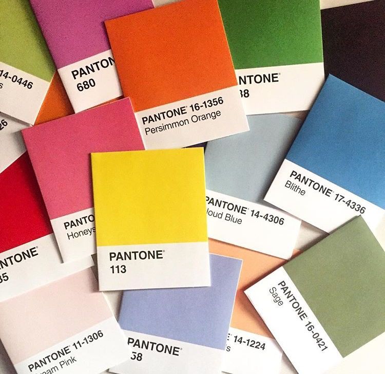
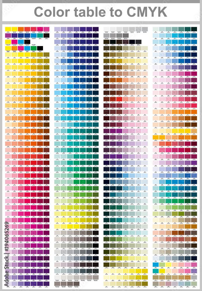
Pantone does have a dedicated color system for the textile industry, but many buyers confuse two different Pantone systems: one is the printing industry’s PMS (Pantone Matching System), and the other is the textile industry’s PMS-T (Pantone Textile System). Although color codes may look similar, the actual dyed colors differ significantly. PMS-T is developed for textile fabrics, but even with the same color code, dyeing on different fabrics yields different results due to material, weave, and finishing processes. Additionally, even using the same color card system, different dye batches and different fabric batches can produce lot differences — this is an inherent characteristic of chemical dyeing.
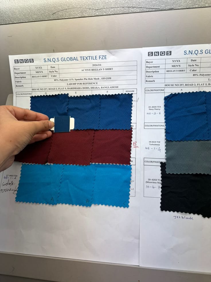
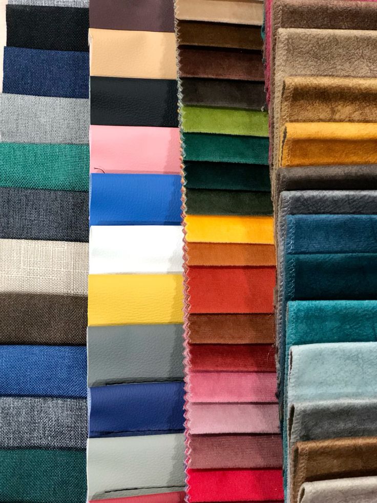
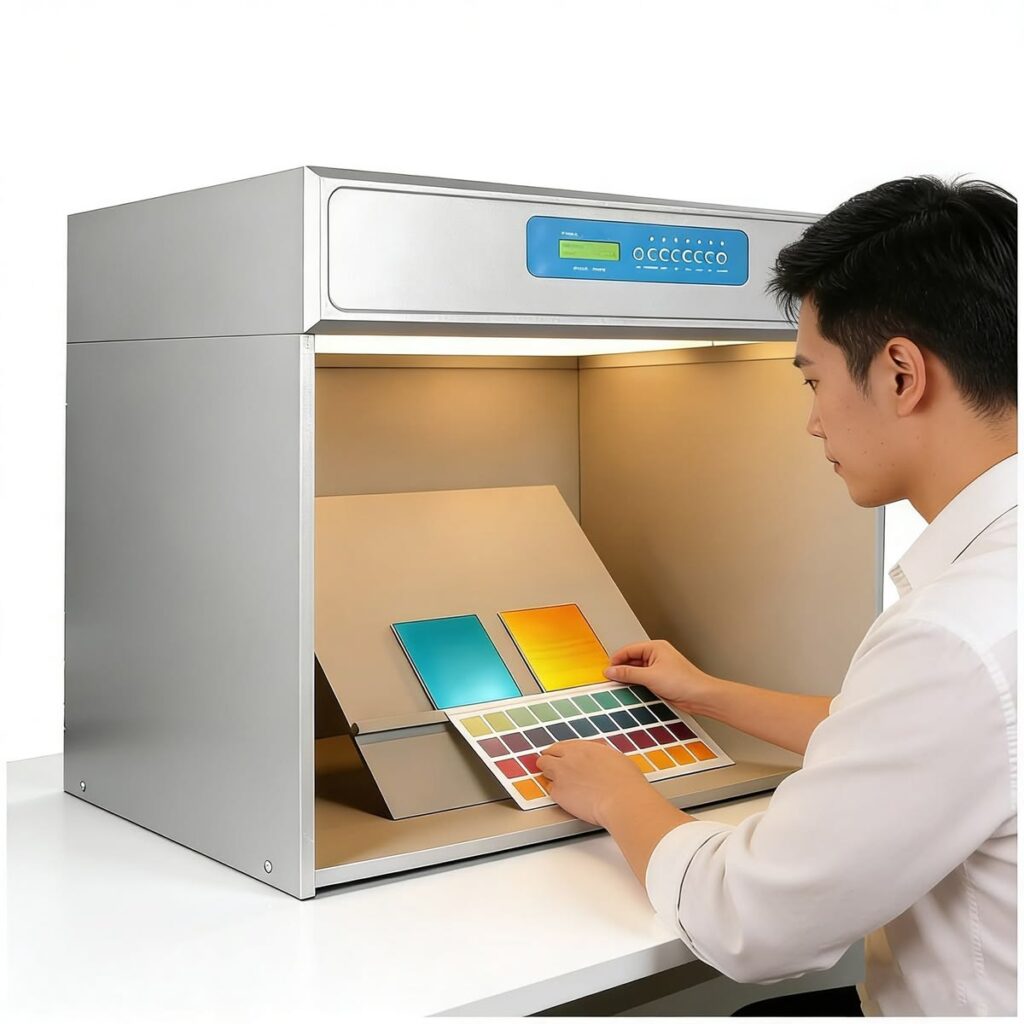
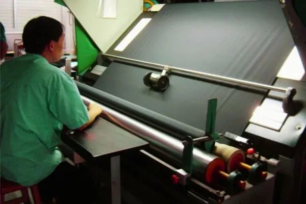
The industry’s standard practice is to resolve color discrepancies through “Lab Dip” or “Strike-off” confirmation. Suppliers provide dyed fabric swatches, buyers confirm and seal them as the color standard for bulk production. This process cannot be skipped, and confirmation should never rely solely on screen screenshots or PDF files. Reputable suppliers will provide 3-5 different batch samples before bulk production for selection to address lot differences. When confirming color cards, buyers should compare colors under standard light box conditions or observe at different times in natural light, as lighting is the biggest factor affecting color perception.
Version 1.0.0
At Cciola, our color card confirmation process includes three steps: first, we provide 3-5 dye batch samples based on buyer’s color cards or physical samples; second, we conduct initial color matching under D65 standard lighting; finally, we re-compare samples with greige fabric before bulk production to ensure consistency. We conduct color deviation spot checks on every roll before shipment to ensure fabric colors in the same order are within acceptable range. For orders with strict color requirements, we recommend buyers provide physical samples as confirmation basis rather than relying solely on color code specifications.
The key to avoiding color disputes is establishing a clear communication process. When specifying colors, try to provide physical samples or dyed fabric swatches as reference; during confirmation, use standard lighting or natural light; before bulk production, request batch samples for comparison. Although these steps increase communication costs, they can prevent greater losses later. Good suppliers will proactively require these processes rather than simply telling buyers “the color is similar.”